ILLUSTRATION &
AI BLENDED ART


ART STYLE & DIRECTION
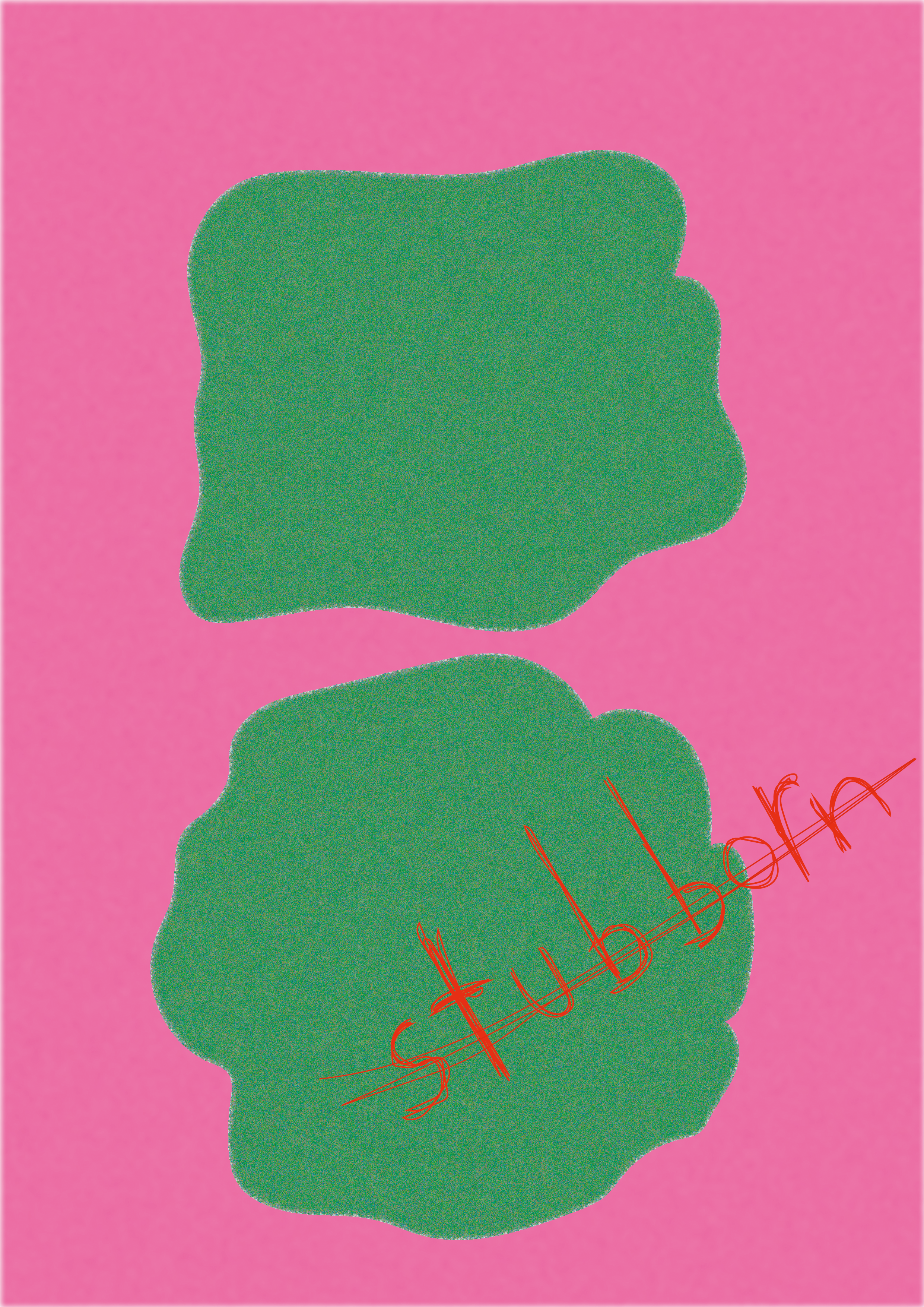
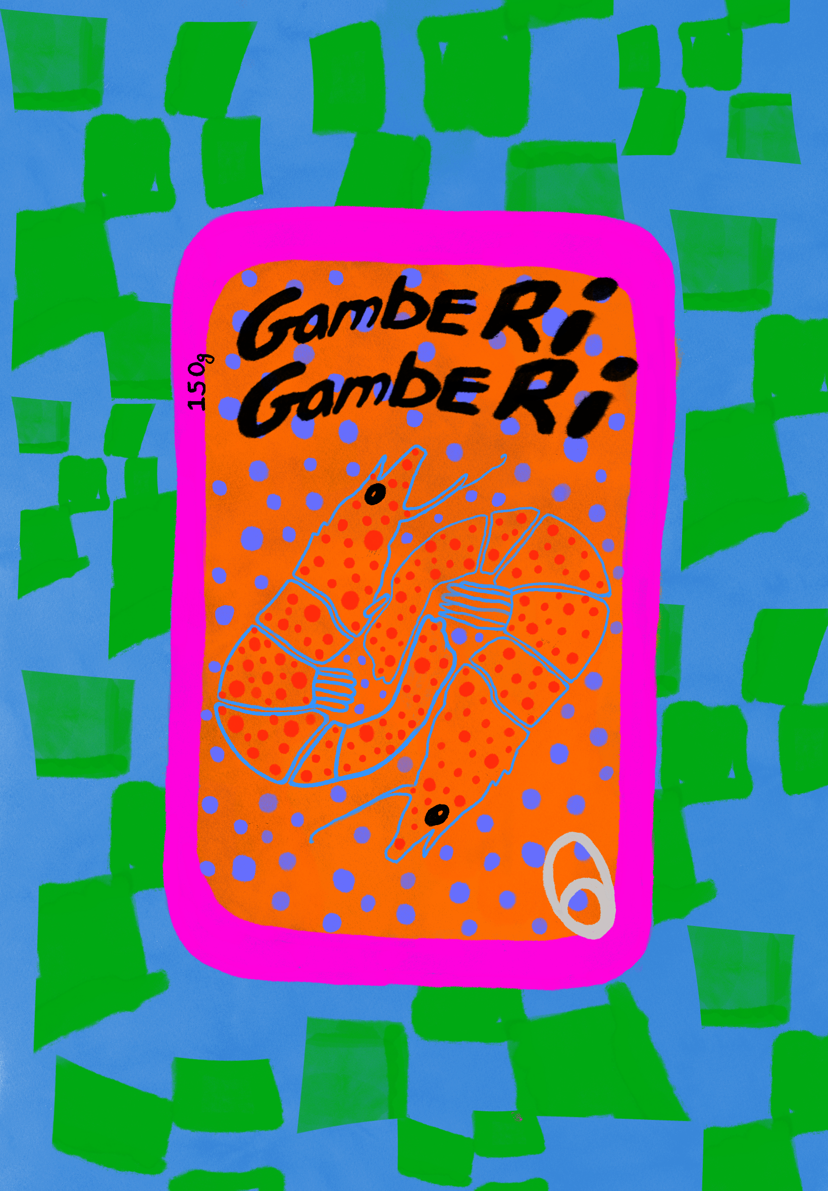
This body of work is rooted in a self-aware, intentionally clumsy design language that draws from street poster culture, lo-fi zines, surreal pop art, and visual overstimulation.
1. Textures & Materials
Crumpled bags, sardine tins, cheap packaging aesthetics, rough fabric overlays.
2. TYPOGRAPHY
Handwritten, scribbled, stretched, or aggressively bolded text that echoes digital shouting or frustrated thoughts.
3. ColoUr Palette
Unapologetically saturated. Neon greens, hyper oranges, pinks, and reds dominate, with intentional color clashes for discomfort and energy.
4. Visual Structure
Compositions often feel like found graphics or scanned posters—flattened, rough, and sometimes unfinished on purpose.
Purpose & Outcome
This series is both an artistic outlet and a visual experiment—channeling the overload of digital life, personal emotion, and ironic nostalgia into a new kind of poster art. It aims to disrupt traditional aesthetics while reflecting back a world that feels chaotic, cheap, funny, and painfully real.

Graphic Brutalism
LINE-ART & HAND-DRAWN
ART STYLE & DIRECTION
This body of work is rooted in a self-aware, intentionally clumsy design language that draws from street poster culture, lo-fi zines, surreal pop art, and visual overstimulation.
1. VISUAL IDENTITY
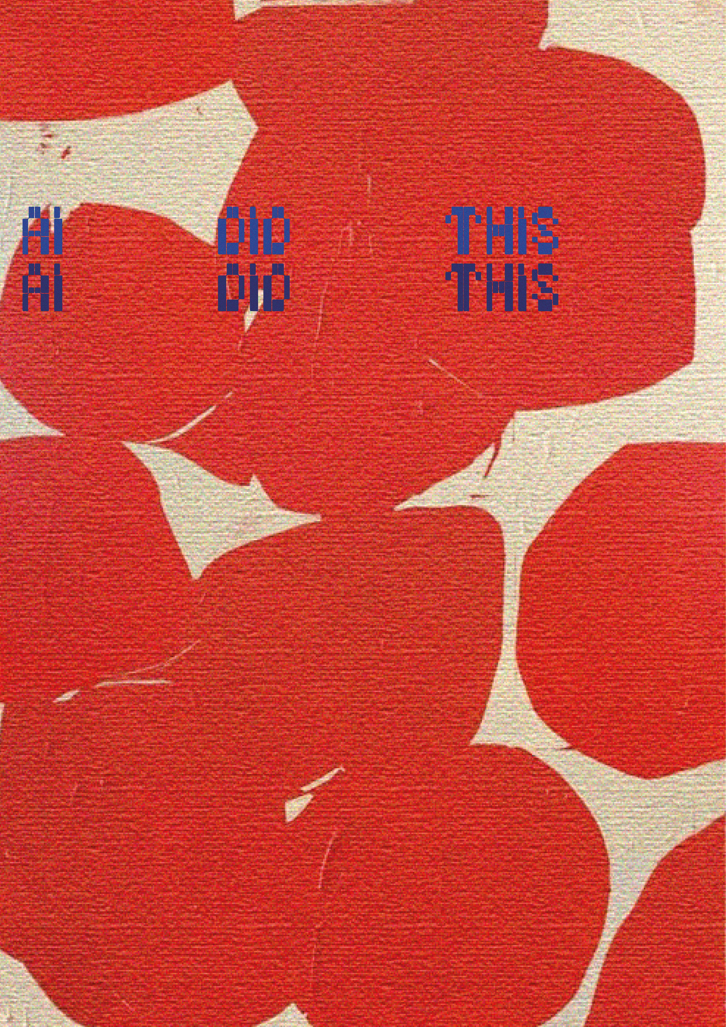
Naive illustration style, limited palettes (black, red, yellow), and high-contrast digital forms.
2. ILLUSTRATION TECHNIQUES
Doodling, freehand line art, and hand-drawn elements are central to the aesthetic, reinforcing the informal, intimate, and raw spirit of the series.
3. TYPOGRAPHY
A mix of distressed block fonts and handwritten text—sometimes charming, sometimes unsettling.
4. SYMBOLS
Rolling pins, buttered toast, pierogis, lemons, pots, abstract limbs—domestic, absurd, familiar.
5. mOOD
Quirky, ironic, cozy-but-strange. The tone moves between wholesome nostalgia and lowkey cult branding.


purpose & impact
This series reclaims the familiar (food, meals, brands) to create strange, inviting visual moments. It reflects on the comfort of repetition, collective rituals, and how design can build mythologies around the most everyday things. The tone is playful, suspicious, and oddly sincere—a love letter to strange traditions and fictional clubs.


HYPERGRAPHIC EMOTIONS
ART STYLE & DIRECTION
This body of work lives in the intersection of graphic design, surrealism, and emotional abstraction. It is a study in visual discomfort, playfulness, and semiotic layering. The pieces presented in this series pose more questions than answers—quite literally, as seen in the recurring prompt: perche? ("why?" in Italian). Each composition uses cultural codes, disjointed forms, and bold graphic juxtapositions to explore identity, strangeness, and the alienation of everyday objects.
1. HYBRID MEDIA
A blend of 3D forms, scanned textures, photography, and graphic type.
2. ColoUr THEORY
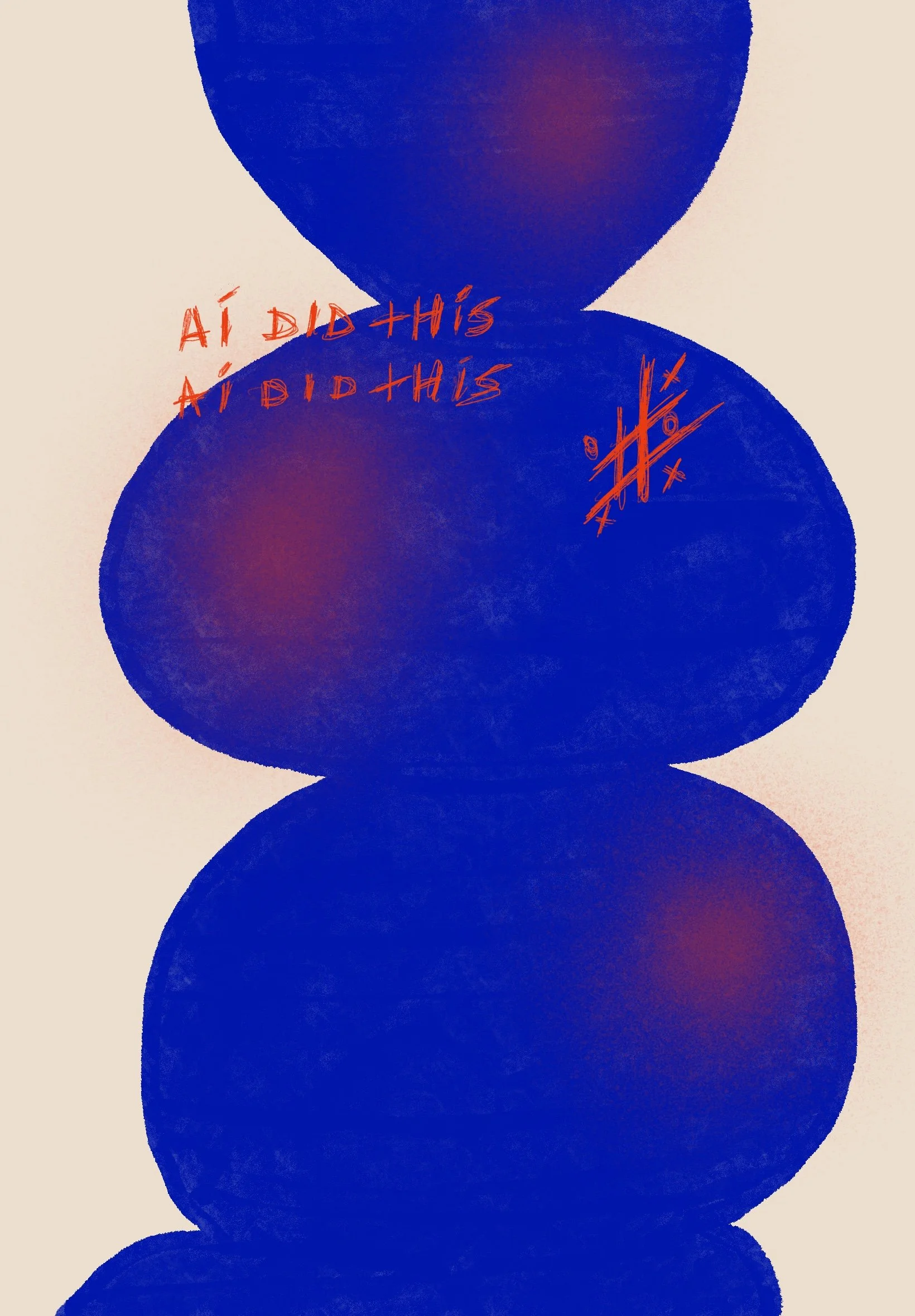
Jarring duotones, flat fluorescents, clashing primaries—meant to evoke mood more than realism.
3. COMPOSITION
Poster-like layouts, centralized hierarchy, or stark grid systems disrupted by symbolic fragmentation.
4.TYPOGRAPHY
Bold, often partially hidden type. Language is used as both meaning and texture.
5.LANGUAGE PLAY
Mix of Italian, Mandarin, English—reflecting global confusion and layered cultural identity.


INTERFACE POETICS
This collection is a visual essay on distortion—of perception, language, and authorship. Each piece investigates how meaning fragments when filtered through emotion, technology, and graphic form. The artworks combine poster-like structure with painterly abstraction, producing a hybrid aesthetic where nothing feels fully analog or entirely digital.
1. Emotional Architecture
Bold forms—whether amorphous blobs or rigid pixels—act as emotional scaffolding. They carry weight, structure, and unease, grounding the viewer in visual tension.
2. Graphic Disobedience
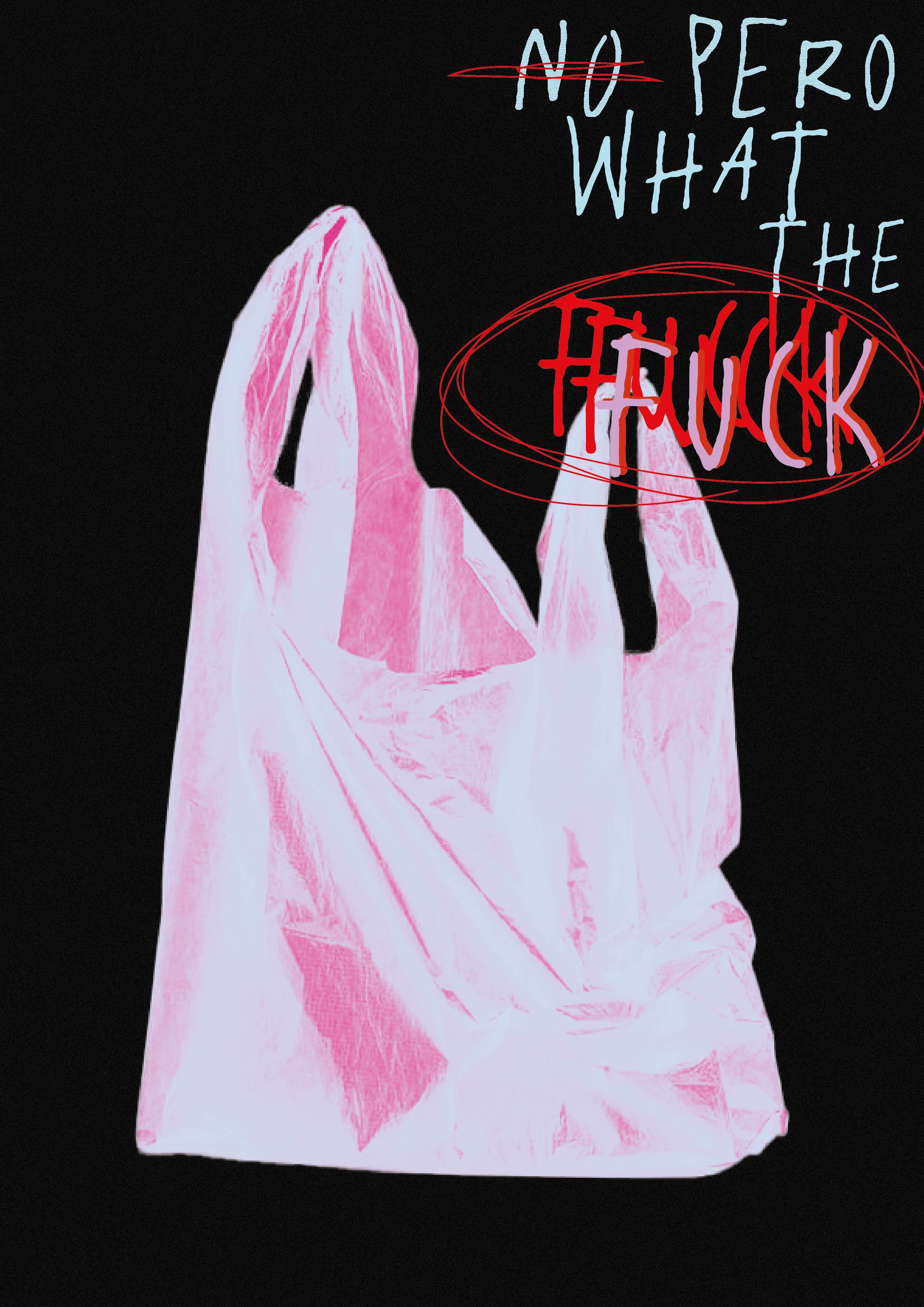
Typography is used not just as communication, but as interruption. Whether scrawled, pixelated, or glitch-like, type fragments the image space—becoming part of the texture, not just the message.
3. Repetition as Distortion
Recurrent elements—shapes, colors, phrases—mirror the overwhelming loops of thought and feeling. Repetition becomes rhythm, then noise.
4. Color as Emotion Code
High-contrast palettes (acid reds, electric blues, punchy neons) are designed not for harmony but for emotional interference. Each composition invites discomfort or curiosity.
5. Thematic Core
At the heart of this series lies a question: what does it mean to see, to feel, to make in an age where boundaries between digital, physical, personal, and artificial dissolve?