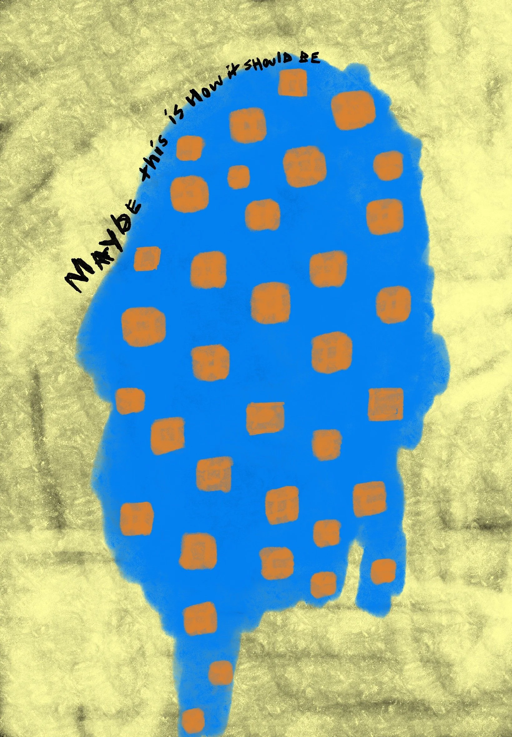
Human Error as a Design Feature
The first mistake I remember noticing was not on a screen, but in a letter.
My grandmother’s handwriting tilted unevenly across the page, certain words pressed darker than others, the ink pooling where her hand hesitated. One sentence drifted upward, another sank. The margins were improvised. And yet, the letter felt alive in a way no perfectly aligned document ever has. You could see where she had paused to think. You could sense the weight of emotion in the pressure of the pen.
Years later, as a designer, I learned to correct those things. Align. Smooth. Standardise. Remove irregularities. Precision became synonymous with professionalism. Error became something to eliminate.
But lately, I’ve begun to wonder if error is not a flaw in design, but a signal of presence.
We live in a culture that worships seamlessness. Apps promise frictionless experiences. Interfaces aim to disappear. Automation works quietly behind the scenes, removing delay, removing hesitation, removing the visible trace of decision-making. The goal is perfection without evidence of effort.
Yet something strange happens when everything works too well. The world begins to feel abstract. Detached. Less inhabited.
Human error - typos, misalignments, interruptions, wrong turns - reminds us that someone is there.
I notice this most when technology fails gracefully. A loading screen that apologises. A system that allows undo. A moment where the machine admits uncertainty. These small gestures feel almost intimate, like a confession. They restore a sense of relationship between user and tool.
In contrast, a system that never acknowledges failure feels cold. It suggests authority without vulnerability. A closed surface that cannot be questioned.
Design has long tried to protect us from our own mistakes. Spellcheckers correct our sentences. Filters remove blemishes. GPS reroutes our wrong turns. The intention is kindness, but the effect is subtle: we are trained to distrust our own deviations.
And yet, deviation is where meaning often enters.
Every creative discipline has relied on accidents. Paint drips that become style. Camera light leaks that become mood. Misprints that become collectible. Jazz improvisation is built on near-failure. Architecture carries the ghosts of revisions inside its walls.
Error introduces time into form. It shows that something happened rather than simply appeared.
When machines generate images flawlessly, they produce abundance but not biography. There is no stumble, no trace of learning. The output is polished but unscarred. It has no memory of how it got there.
What human error offers instead is friction - the pause where choice becomes visible.
I think of conversations that go wrong. Of words said too early or too late. These moments, awkward as they are, create intimacy. They show risk. A willingness to be misunderstood. A willingness to be present without script.
Design that includes space for error does something similar. It allows room for interpretation. It invites participation instead of obedience.
This is why the most lasting systems are not the most efficient ones, but the most legible. They make their boundaries visible. They allow for hesitation. They let failure remain part of the story instead of erasing it. In doing so, they replace authority with understanding.
In a workplace, this becomes cultural. When mistakes are hidden, fear grows. When mistakes are named, learning becomes possible. The same is true in software, in institutions, in relationships. Transparency creates trust. Silence creates distance.
There is also something ethical in designing for error. It acknowledges that humans are not predictable inputs. We arrive tired. Distracted. Emotional. We misread instructions. We click the wrong thing. We change our minds.
A design that expects perfection does not make space for life. I have begun to see error not as something to fix, but as something to interpret. To ask what a wrong turn reveals, what confusion teaches, what the next step requires. These questions shift design away from mastery and toward responsibility.
These questions shift design from control to care.
When everything is optimised, we forget that uncertainty is not a bug of being human. It is the condition of it. Error is where responsibility enters. Where choice becomes visible. Where authorship begins.
Perhaps this is why the most meaningful objects still carry marks of use. Scratched tables. Dog-eared books. Uneven brushstrokes. They record time, not just intention. They show that something has been lived with, not merely produced.
We often imagine the future as cleaner, smoother, more automated. But I suspect the future will need spaces where imperfection is allowed to breathe. Where systems can pause. Where humans can hesitate without penalty.
Human error is not the opposite of intelligence. It is the proof of it.
To design with error in mind is not to lower standards. It is to raise empathy. It is to admit that the most important part of any system is not how it performs when everything goes right, but how it responds when something goes wrong.
In that response - gentle or harsh, open or closed, we see what the design truly believes about the people using it.
And maybe that is what design is learning again: not how to erase the human, but how to make room for them.
